SumUps.ai
VISITAR SITIO
AI-driven algorithms seamlessly transform raw qualitative data into actionable insights, empowering policymakers to make informed decisions that resonate with the pulse of their communities. Tired of drowning in open-ended data? Dive into insights instead.
Want to know how we did it?

01
We faced a problem
A Government firm in Toronto, Canada is inundated with an avalanche of citizen feedback across various channels (particularly survey feedback done by Community Engagers).
How can policymakers efficiently sift through this overload of information to extract meaningful insights?
Traditional manual approaches are time-consuming, labor-intensive, and often fail to capture the nuanced sentiments and emerging trends within the community.
02
A need was clear
There exists a pressing need for an innovative solution that harness the power of AI to streamline the qualitative feedback analysis process and enable policy makers to make informed decisions that truly reflect the needs and aspirations of their citizens.
BUT… How might we leverage AI to automate this process?
03
Challenges arised
How might we democratize complex technology for non-technical users, ensuring advanced functionalities are balanced with user-friendly interfaces and straightforward interactions?
How might we effectively visualize diverse feedback data types, like text-based comments and sentiment scores?
How could we balance automation and human input to provide meaningful insights while allowing deeper interpretation?
04
So, multiple iterations later, we built a solution
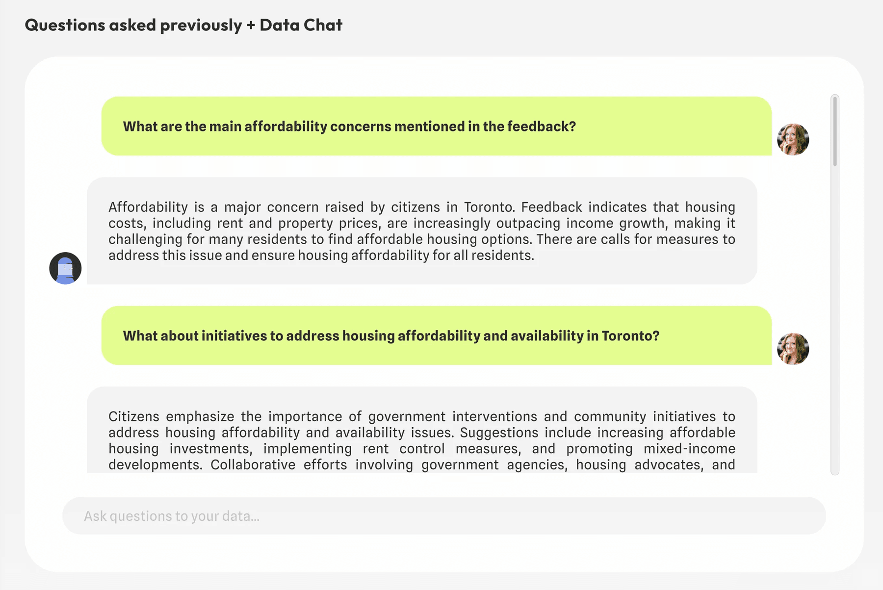
Three flows were designed to cater to different types of feedback data and user needs, ensuring a comprehensive and intuitive user experience.
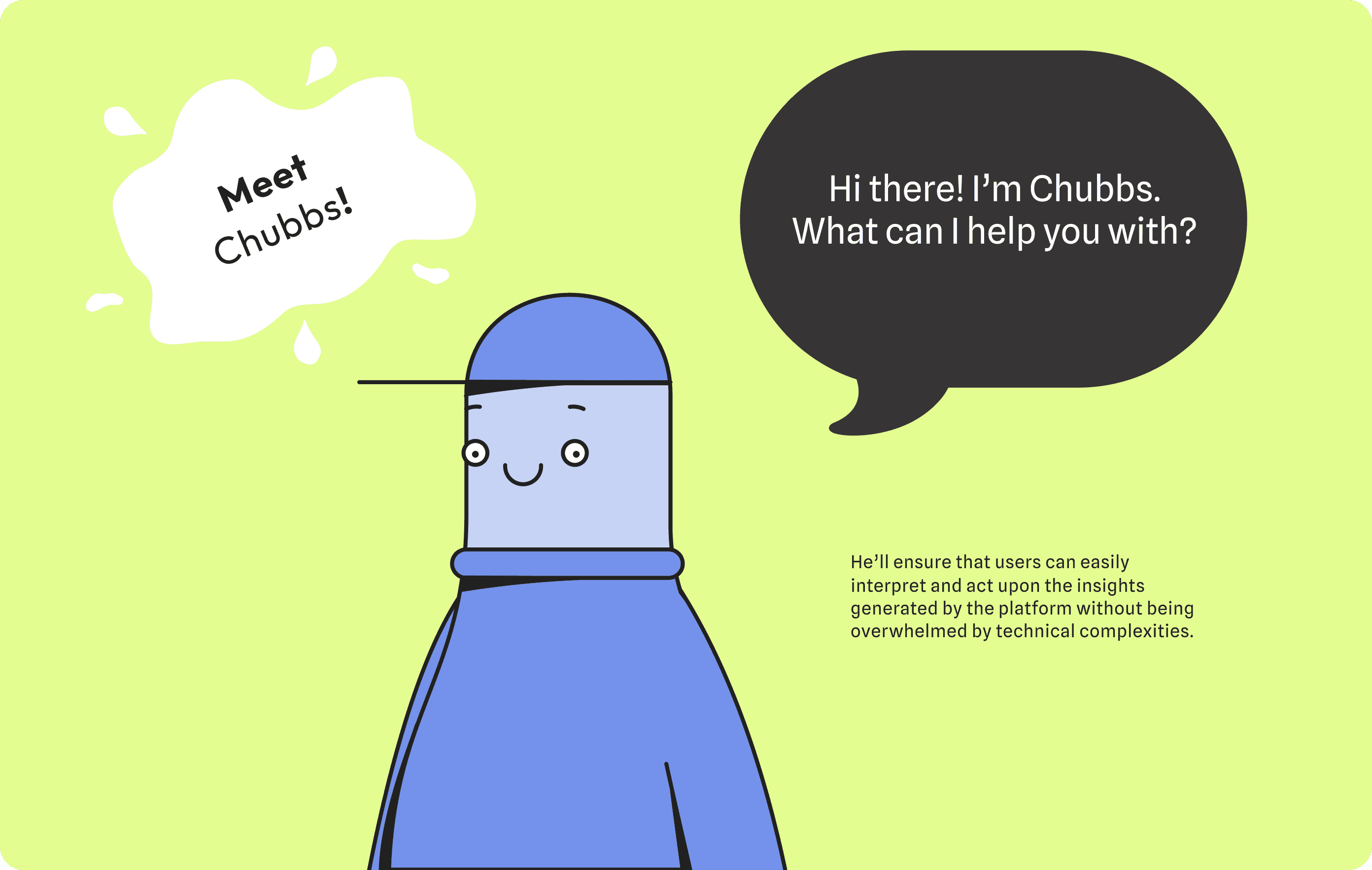
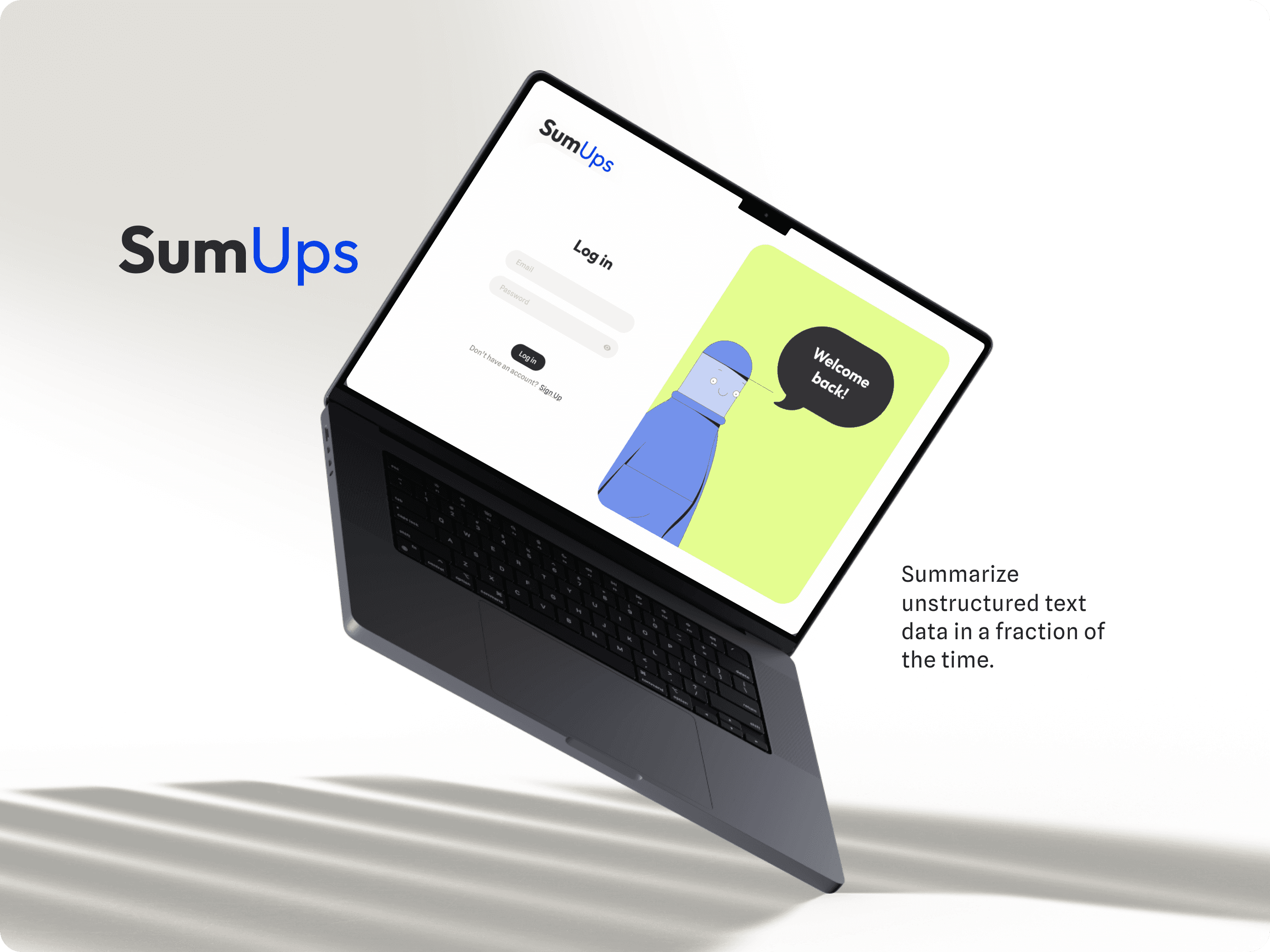
How did we make it easy for users? Meet Chubbs, he’ll ensure that users can easily interpret and act upon the insights generated by the platform without being overwhelmed by technical complexities.
UI design utilizes Outfit for titles and Spline Sans for body text, ensuring a harmonious blend of elegance and readability. The color palette, including Lime for vibrancy and Sky Blue for freshness, enhances visual appeal while maintaining professionalism and clarity, fostering user engagement and trust.
Our dashboard features clean organization and thoughtful design, allowing seamless navigation between projects. With Chubbs guiding the way, users effortlessly start new projects, receive report readiness notifications, and access support as needed.
Need more detail? Check out the Behance case, or let's chat!